

Cart
0
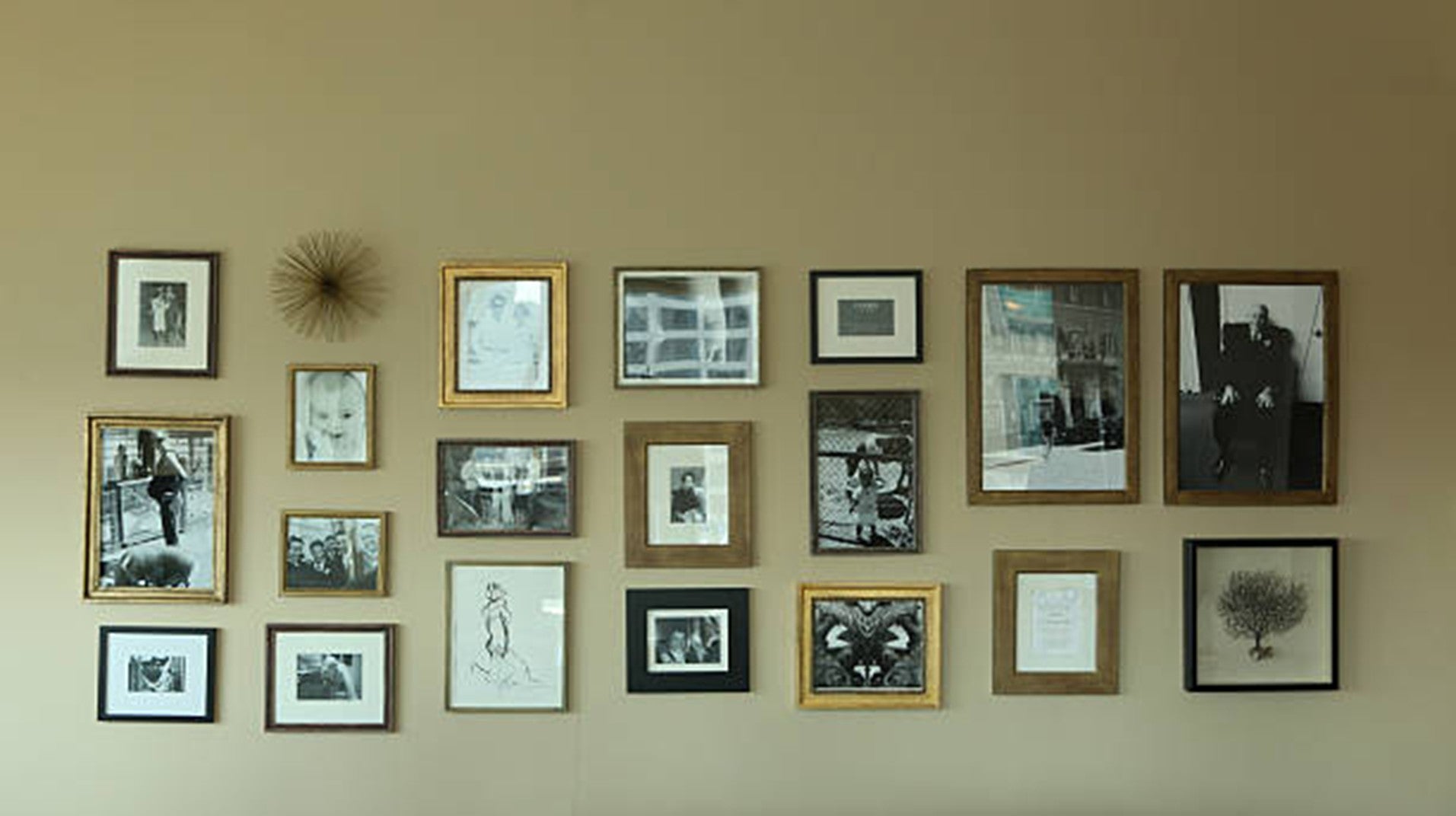
A beautiful photograph can still feel out of place when its colors compete with the room around it. The key is not finding artwork that matches every shade exactly, but choosing a piece that connects naturally with the walls, furniture, lighting, and overall mood.
Warm landscapes can soften neutral spaces, while cooler coastal or mountain scenes may bring balance to rooms with deeper tones. Scale, contrast, and framing also influence whether the artwork feels intentional or disconnected.
Before selecting a print based on subject alone, let’s first understand how color relationships shape the final look. Read the blog below to learn how to choose photography wall art that feels like a natural part of your room.
Key Takeaways
-
Repeat small accent colors instead of matching large surfaces exactly.
-
Use photographs with several tones to connect different room colors.
-
Choose contrast according to the brightness of the walls and furniture.
-
Match the photograph’s visual energy to the purpose of the room.
-
Select frames and mats that support the artwork without overpowering it.
-
Check how natural and artificial lighting affect the finished display.
1. Match and Repeat Colors in Photography Wall Art
Echo Small Accent Colors
The easiest way to coordinate photography wall art with a room is to repeat a minor accent rather than match the largest surfaces exactly. Look at the colors in cushions, rugs, curtains, lamps, or decorative objects. If a neutral living room includes rust-colored pillows, for example, a photograph with small areas of autumn foliage can create a subtle visual connection.
This approach gives the artwork a relationship with the room without making the design feel overly matched. It also leaves more flexibility if you later replace smaller accessories.
Create a Smooth Color Transition
When a room includes several noticeably different colors, use photography wall art to create a visual transition between them. Instead of repeating one small accent, choose an image with gradual shifts in tone, such as green trees leading into blue water or warm buildings beneath a cool evening sky.
The Boston wall art collection includes city, waterfront, bridge, and park scenes with layered color combinations. These images can soften the contrast between different furnishings and help the room feel balanced without making every element look deliberately matched.
Use Black-and-White Photography for Flexibility
Black-and-white photography wall art is a practical choice when a room already includes several patterns or strong colors. Monochrome images add form, texture, and visual interest without introducing another competing hue.
Brightness still matters. A print with large pale areas may work well against a dark wall, while a shadow-rich photograph can add definition to a lighter interior. The frame and mat should also support the room’s overall temperature, whether it feels warm, cool, or neutral.
Scenic New Hampshire puzzles can also provide inspiration for regional color palettes. Mountain views, covered bridges, winter scenes, and seasonal landscapes show how natural shades can work together without appearing overly coordinated.
2. Create Contrast and Balance
Add Definition to Light-Colored Rooms
Light walls can make a space feel open, but they may also cause pale artwork to disappear. In rooms with white, cream, beige, or light gray surfaces, choose photography wall art with stronger shadows, richer scenery, or more defined architecture.
A city skyline, dramatic mountain view, or saturated autumn landscape can create a clear focal point and give the room greater visual depth.
Brighten Darker Interiors
Dark walls and heavy furniture benefit from photography with lighter visual areas. Open skies, reflective water, snow, pale buildings, and softly illuminated landscapes can prevent the room from feeling too enclosed.
The goal is not to choose the brightest image available. Instead, look for a composition with enough light to stand apart from its surroundings while still fitting the atmosphere of the room.
Support the Room’s Intended Mood
The subject and color intensity should reflect how the room is used. Bedrooms, reading areas, and quiet spaces often suit misty landscapes, muted coastlines, gentle winter scenes, or calm nature photography.
Living rooms, dining areas, and offices can handle bolder colors, stronger movement, and more detailed imagery. A bright city scene or dramatic seasonal landscape may feel more appropriate in a room designed for activity and conversation.
The White Mountain autumn image, also available as a landscape jigsaw, demonstrates how golden foliage, evergreen trees, gray mountains, and cooler sky tones can inspire a balanced wall-art palette. This type of composition may work particularly well in rooms that contain both warm wood and cool-colored textiles.
Reinforce a Mountain-Inspired Interior
A cabin, lodge, sports room, or outdoor-themed space may benefit from imagery that strengthens the room’s identity. Tuckerman Ravine Original Photographs offer a relevant example of ski wall art connected to New Hampshire mountain culture.
Rather than simply adding seasonal color, this type of image introduces a sense of place, movement, and personal interest. It may be especially meaningful for homeowners who enjoy skiing, hiking, or traveling through New England.
3. Choose the Right Frame
Keep Modern Rooms Clean and Simple
The frame creates a visual boundary between the photograph and the wall. Modern interiors usually work well with thin black, white, or light oak frames.
Black adds definition, white creates a lighter presentation, and pale wood introduces warmth while keeping the overall look simple. The best option depends on the room’s furniture, hardware, and existing finishes.
4. Add Warmth to Traditional Interiors
Traditional spaces can support richer materials such as walnut, cherry, dark wood, antiqued gold, or vintage-inspired frames. These finishes pair naturally with historic architecture, rural photography, autumn scenery, and classic New England images.
The frame does not need to copy the colors inside the photograph. It can instead coordinate with nearby furniture, flooring, curtain rods, lighting fixtures, or cabinet hardware.
Use Mats to Control Visual Weight
A mat gives photography wall art breathing room and helps separate the image from the frame. White and off-white mats create a bright, versatile presentation that works with many interiors.
Black mats provide a more dramatic effect and may suit monochrome or high-contrast images. However, they can feel heavy in a small or dim room, so the mat color and width should be chosen according to the room’s lighting, frame style, and image size.
Conclusion
Choosing the right photography wall art is less about copying every color in a room and more about creating a clear visual relationship. The photograph should support the space through tone, contrast, mood, and presentation while still bringing its own character to the wall. Small color connections can make the room feel unified, while thoughtful differences prevent the design from becoming flat or overly matched.
Lighting and framing also shape how the finished artwork is experienced throughout the day. When these details work together, the artwork feels naturally placed and personally meaningful, helping the entire room appear more polished, expressive, welcoming, and visually complete.
Explore New England Wall Art & Puzzles for meaningful photography that complements your room beautifully.
FAQs
Should artwork match the wall or the furniture?
It does not need to match either one exactly. Artwork can connect with a smaller accent color, share a similar undertone, or create intentional contrast with both the wall and furnishings.
How can I compare artwork colors when shopping online?
Photograph the room in natural daylight and keep paint swatches or fabric samples nearby. A digital room mockup can also help you compare the artwork with the existing palette before ordering.
Can several photography styles be used in one room?
Yes, provided the images share a visual connection. Similar framing, consistent matting, related color temperatures, or a common regional theme can make different photography styles feel cohesive.
Does the artwork look different after framing?
Yes. Frame color, mat width, glazing, and surrounding wall color can change how bright, warm, dark, or prominent a photograph appears. Review the complete presentation rather than judging the image alone.
How does print size affect color impact?
Larger prints make their dominant colors more noticeable, while smaller prints have less influence on the overall palette. A vivid photograph may feel balanced at a modest size but overpowering when enlarged.
Can seasonal photography remain displayed throughout the year?
It can, especially when the image connects with permanent room colors rather than temporary decorations. Mountain, coastal, forest, and city photography often works year-round when its palette suits the interior.

